sweetsify
brochure
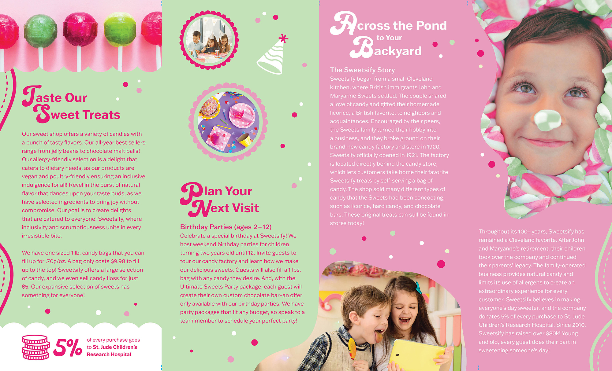
Sweetsify is a fictional candy company that produces and markets a variety of sweets. It was established in the 1920s by John and Maryanne Sweets, who were British immigrants. Sweetsify offers locally made candies reminiscent of popular British and American treats, including licorice, several flavors of hard candies, chocolate bars, and many more options. Customers can choose their preferred sweets and fill clear bags and purchase according to the weight. The sweet shop offers birthday parties for children aged 2 to 12 and factory tours starting at $10 for all visitors.
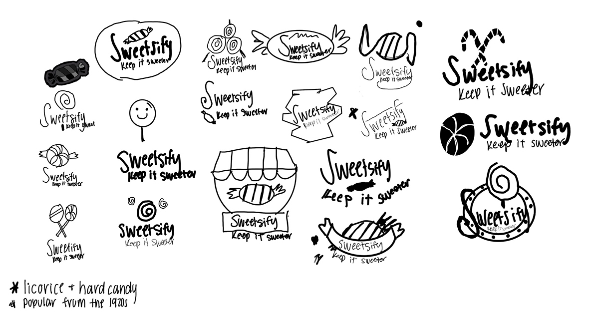
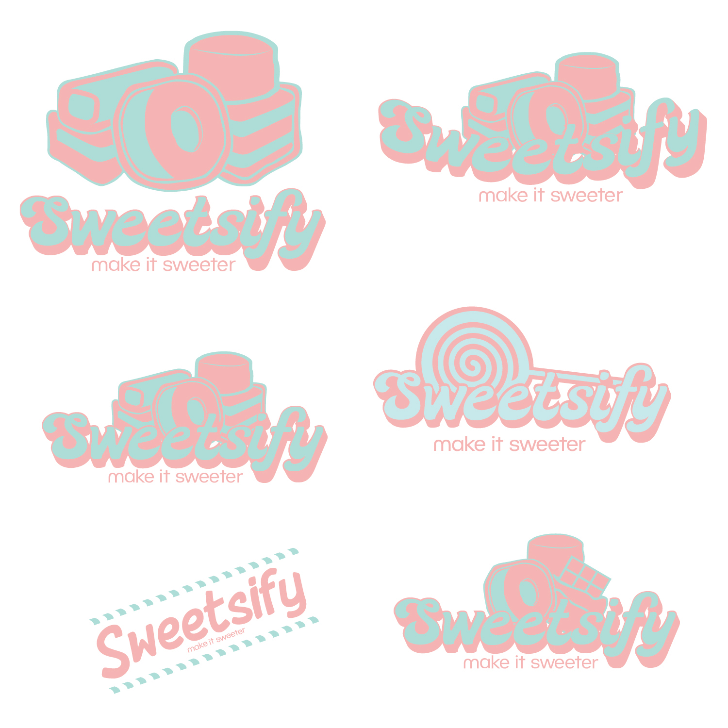
With the provided name of the brand, a team of two researched/created Sweetsify’s identity history. The typeface in the logo is a combination of typefaces Lick a Candy and BC Novatica CYR.
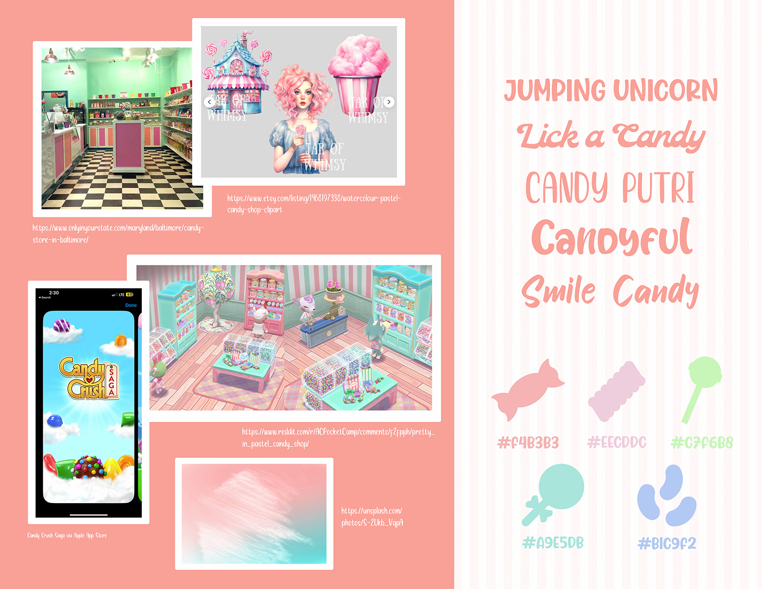
Lick a Candy is a script font that evokes the feeling of a candy store. The BC Novatica CYR font, with its rounded sans-serif design, complements Lick a Candy, ensuring readability at any size. Franklin Gothic ATF font family is for the headers, subheads, bullet points, and body copy to improve readability. Sweetsify’s colors showcase its classic sandy shop vibes and colors with shades of pink and green.
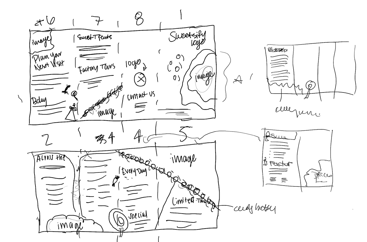
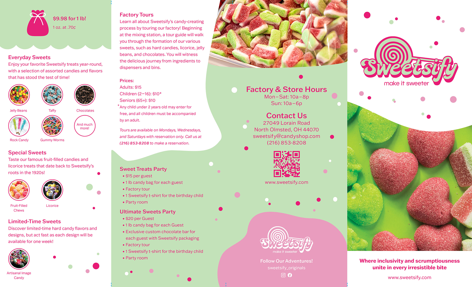
The 14”x8.5” brochure and provides information on Sweetsify’s history, products, services, and contact details, including a scannable QR code to access the website, using a roll fold format. Sweetsify proudly presents a diverse range of irresistible candy options that flawlessly showcase its premium products with imagery. The brochure’s splashes of color and patterns guide the reader’s eye along the copy.
illustrations
candy bag
donations
party hat
color & type study

c:2 m:98 y:22 k:0
r:232 g:28 b:119
hex#:e81c77
c:0 m:52 y:0 k:0
r:243 g:150 b:191
hex#:f396bf
c:23 m:0 y:35 k:0
r:197 g:226 b:182
hex#:c5e2b6

c:0 m:0 y:0 k:0
r:255 g:255 b:255
hex#:ffffff


